 Amwayi
Three designs in a week
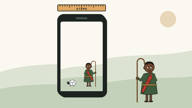
This site started quiet and literary, got a bolder mascot, then a full redesign around the illustrated shepherd you see now. Umwayi means shepherd, so that’s who it’s drawn around.
What looking caught
Every round, the code looked fine. The problems only showed up when the pages were built, opened at phone and desktop width, measured, and looked at. The first mascot read as flat the moment I saw a screenshot. Code blocks and headlines spilling off a phone screen came down to one CSS line. Today an illustration that sat off-centre on wide screens came down to a single reset rule overriding everything else. None of that was visible from the source.
Where the content lives now
The articles, project pages and illustrations moved out of the site’s code and into my journal hub, as plain markdown. Updating the site now means editing one file there.
What I took from it
- Render it and look before believing it works.
- Measure the actual page; don’t infer from the CSS.
- Keep content apart from code so either can change alone.
Comments